


Redesigned the onboarding flow, increasing completed applications by 20%.
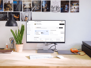
DOT Business is the smart, secure mobile and web banking app built for businesses that want more control and less hassle.
YEAR
2025
ROLE
Product Designer
SKILLS
UX Research, Product Design, Usability Testing
TOOL
Figma, FigJam
PLATFORM
Mobile and Web
COLLABORATION
Faith Jegede, Esther Oke, Jeff Ango, Francis Unekwe
BACKGROUND
Simplified the onboarding flow for business users.
I designed the onboarding experience for Dot Business Banking across both mobile and web platforms. The existing onboarding flow was cumbersome and required users to complete multiple steps before successfully signing up.
The goal of this project was to simplify the onboarding experience by reducing unnecessary screens, improving clarity, and helping users onboard faster while still meeting business and compliance requirements.


CHALLENGE
Key objective
01.
Simplify the Onboarding Flow
The initial onboarding process was lengthy and overwhelming. The objective was to reduce friction by minimizing steps and consolidating information.
02.
Users needed a clearer understanding of what was required at each stage of onboarding to avoid confusion and drop-offs.
Improve User Clarity
03.
Reduce Time to Completion
The onboarding experience needed to help users complete setup faster without compromising accuracy or compliance.
04.
Ensure the redesigned flow is aligned with regulatory requirements while still feeling easy and intuitive for user
Support Business and Compliance Needs

RESEARCH
Understanding the potential users
To better understand the needs and expectations of Dot’s target users, I focused on learning how business owners interact with digital banking products and where friction commonly occurs during onboarding.
This included:
• Reviewing existing onboarding flows
• Identifying common pain points in business account setup
• Understanding user expectations around speed, clarity, and trust in financial products
These insights helped guide decisions around structure, content prioritization, and flow simplification.
RESEARCH
Analysis Dot existing onboarding and that of other banks
I analyzed onboarding experiences from similar digital and business banking platforms to understand industry patterns and best practices.
The focus was on:
• Number of onboarding steps
• How information was grouped and presented
• Use of progress indicators and guidance
• How complex requirements were simplified for users
This analysis helped highlight opportunities to reduce friction and improve clarity in Dot’s onboarding flow.
Key Insights
From research and competitive analysis, a few key insights stood out:
• Users are more likely to complete onboarding when steps are broken into smaller, clear sections
• Reducing the number of screens improves perceived speed
• Clear guidance and progress indicators help users feel more confident during setup
• Simplicity builds trust, especially in financial products
These insights directly informed the redesigned onboarding structure.
DESIGN WORKSHOP
Design Collaboration & Ideation
I collaborated with stakeholders and the development team to align on goals, requirements, and design direction.
Through design discussions and brainstorming sessions, we:
• Clarified business and user goals
• Explored layout and content approaches
• Aligned on technical feasibility
• Iterated on design concepts before finalizing visuals
This collaborative process ensured the designs were both user-centered and build-ready.
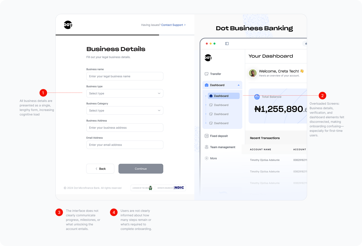
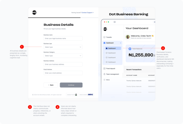
DOT EXISTING WEBSITE ONBOARDING SCREEN
REDESIGNED WEBSITE ONBOARDING SCREEN
DESIGN WORKSHOP
Design Collaboration & Ideation
I worked closely with product managers, engineers, and stakeholders through design discussions and brainstorming sessions.
Together, we:
• Reviewed onboarding requirements
• Explored ways to simplify complex steps
• Aligned on technical feasibility and business constraints
• Iterated on the onboarding flow before moving into high-fidelity designs
This collaboration ensured the final designs were both user-friendly and technically feasible.
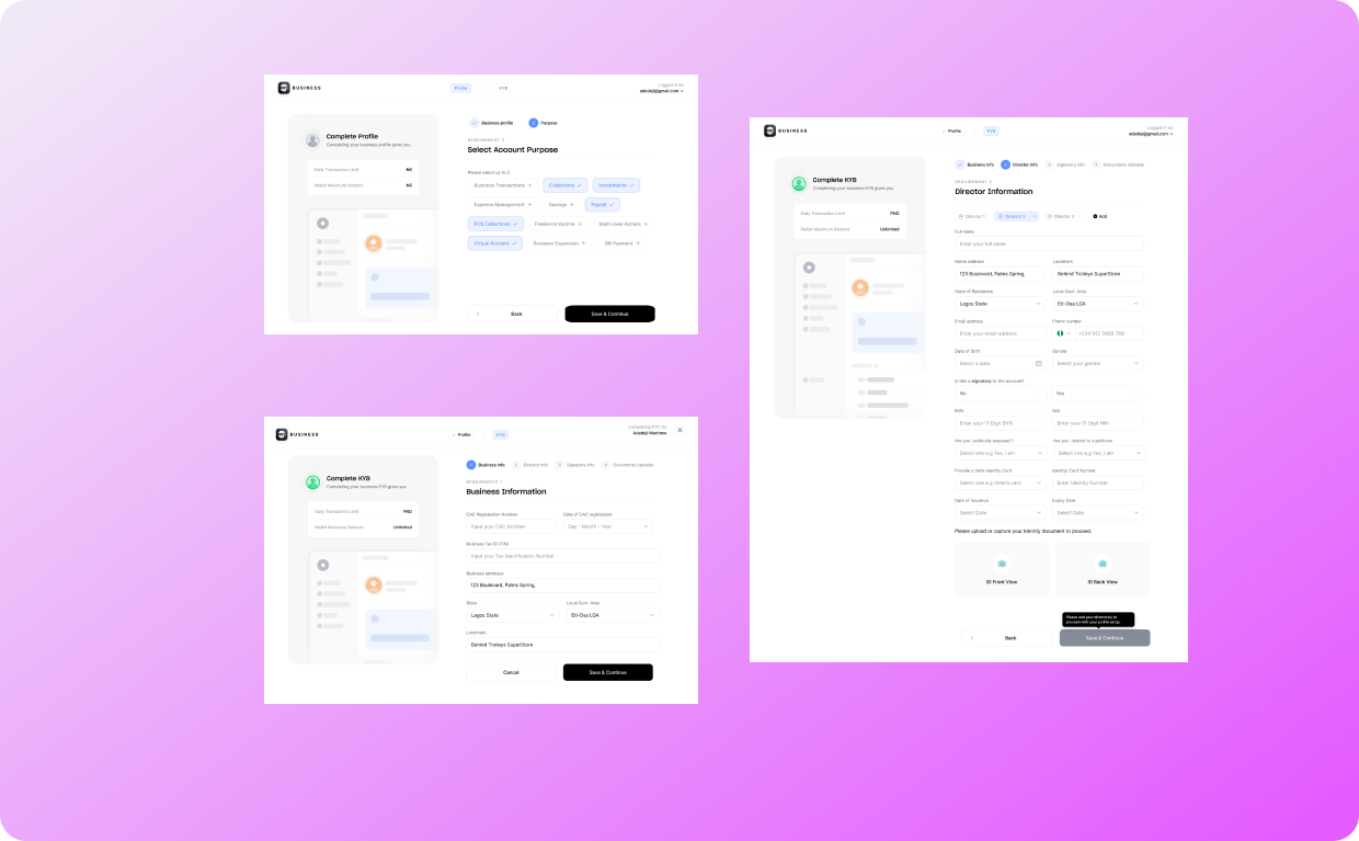
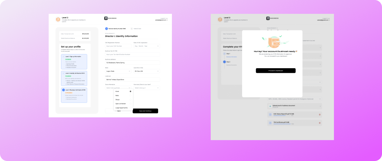
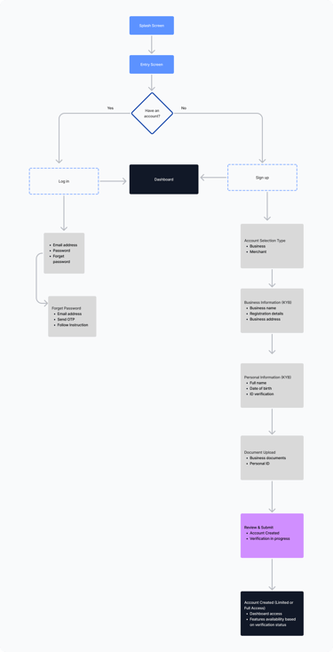
MAPPING USER INTERACTIONS
Visualizing key user journeys to streamline login, account creation, and verification.
I created flow diagrams to map out the core user actions within the onboarding experience, including account entry, account creation, and verification processes. These flows helped visualize the complete user journey from first interaction with the app through account setup and dashboard access.
Mapping the flow allowed me to identify potential friction points, simplify complex onboarding steps, and ensure that KYC and KYB requirements were integrated in a way that felt clear and manageable for users while still meeting business and compliance needs.

Buying a Health Plan User Journey flow
USER ONBOARDING FLOWCHART
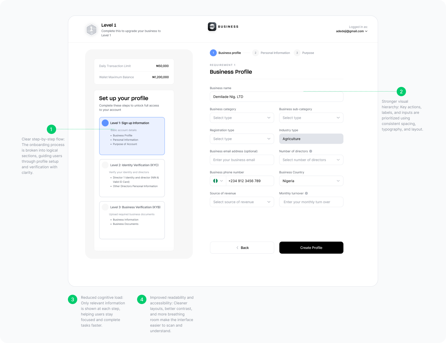
SOLUTION
Visual Design & Final Screens
I designed high-fidelity website screens in Figma, focusing on clarity, accessibility, and consistency.
Key design considerations included:
• Clear information hierarchy
• Simple and intuitive navigation
• Readable typography and spacing
• A friendly, trustworthy visual tone
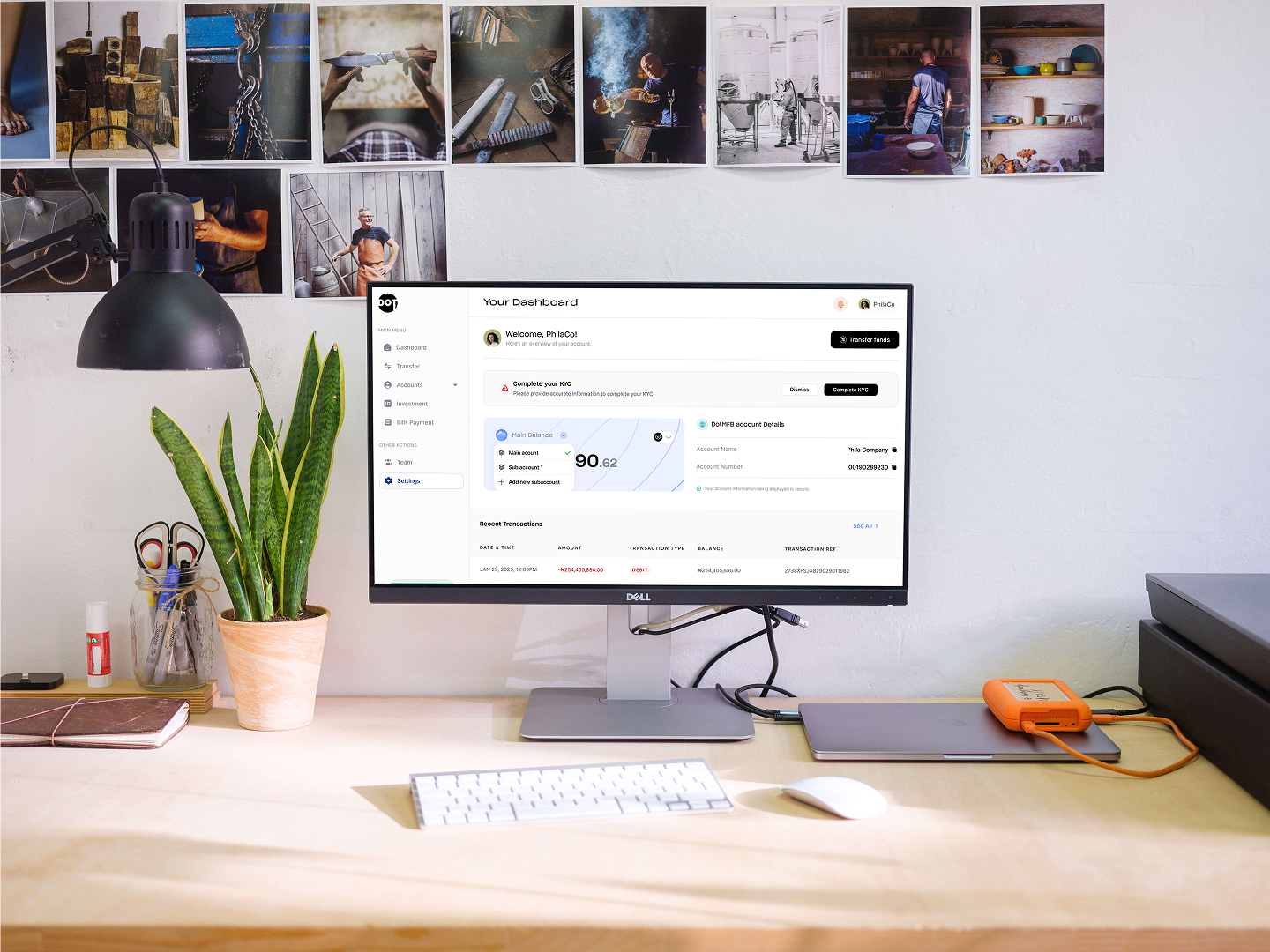
The final designs were implemented by the developer and are now available as a live website.
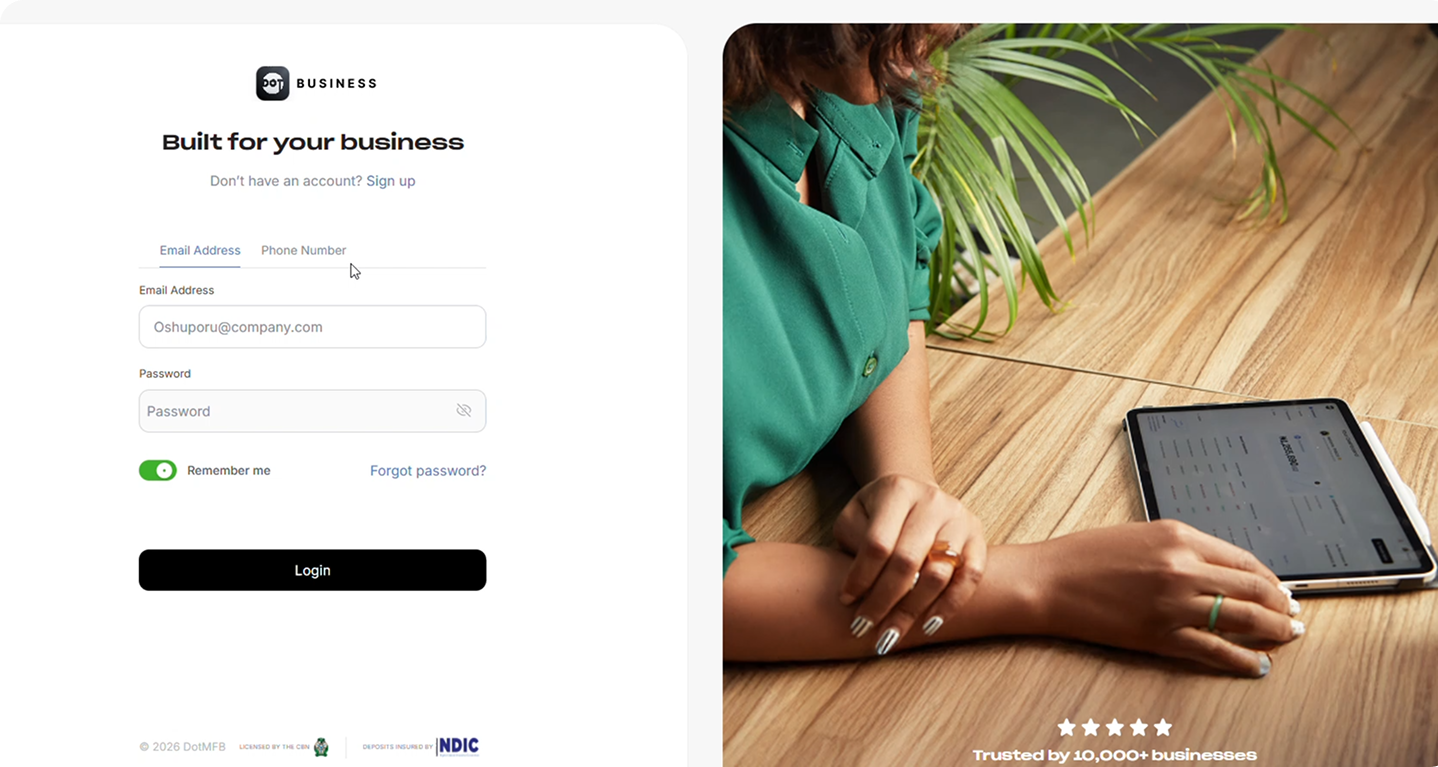
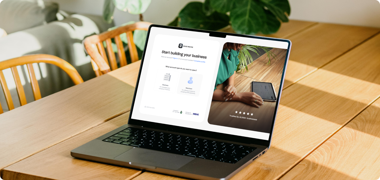
SIGN UP SCREEN