
Simplifying healthcare access and patient experience for DotHMO users.
DotHMO is a health insurance platform designed to help users understand, choose, and access health coverage easily.
I designed the DotHMO website with a focus on clarity, accessibility, and trust. The goal was to simplify how users explore health insurance plans and understand key information without feeling overwhelmed
YEAR
2025
ROLE
Product Designer
SKILLS
UX Research, Product Design, Usability Testing
TOOL
Figma
PLATFORM
Web
COLLABORATION
Worked closely with a developer to translate designs into live website

CHALLENGE
Key objective
01.
Improve Clarity
Health insurance information can feel overwhelming. The primary objective was to present content in a clear, structured way that users can easily understand.
02.
Design a friendly and credible experience that helps users feel confident exploring health coverage options.
Save User Time
03.
Reduce Errors & Drop-offs
Ensure users can find relevant information quickly without unnecessary complexity.
04.
Design with readability, inclusion, and ease of use in mind.
Create an Accessible Experience


RESEARCH
Understanding the potential users
To understand how people perceive and interact with health insurance platforms, I conducted informal research by reviewing Health Insurance companies and speaking with potential users, including co-workers, family members, and friends.
This helped uncover common concerns, expectations, and pain points around health insurance.
Here are my findings
4/5 participants mentioned that health insurance information is often difficult to understand.
Someone said “Most of the terms are confusing. I just want to know what I’m paying for and what I get.”
3/5 participants said they find it hard to compare plans or know which option is right for them.
Another Said “It’s hard to tell the difference between plans without reading everything.”

5/5 participants expressed a strong need for clarity and trust when choosing a health insurance provider.
“I need to feel confident that the provider is reliable before signing up.” says another participant

RESEARCH
Competitive Analysis
I conducted competitive benchmarking to evaluate existing digital health insurance and HMO platforms. This analysis helped me understand industry standards, identify recurring user pain points, and uncover opportunities to differentiate DotHMO within the healthcare insurance space.
To align both user needs and business objectives, my research focused on the following:
Competitor platform evaluation:
I reviewed multiple health insurance and HMO websites, exploring plan discovery, enrollment, claims information, and customer support flows to understand how users interact with existing solutions.

User flow comparison:
I analyzed key user journeys—such as onboarding, plan selection, provider discovery, and benefits access—assessing clarity, ease of navigation, and friction points throughout the experience.

industry gap identification:
I identified common challenges across competitors, including complex insurance terminology, unclear plan benefits, poor transparency around coverage and pricing, lengthy onboarding processes, and limited digital self-service tools
RESEARCH
Key Insights & Market Gaps
My research and competitive analysis identified several critical gaps in existing digital health insurance platforms. These insights highlight opportunities to differentiate our product and improve the user experience.
Hidden critical actions:
Some platforms placed essential actions (e.g. closing modals) in non-obvious locations, increasing friction and breaking familiar UI patterns. Clear UI patterns present a strong opportunity to improve engagement.
Poor Plan Comparison Experience
One platforms make it hard to compare health plans side by side, forcing users to switch pages or rely on PDFs. Structured layouts that highlight differences in coverage, pricing, and benefits will boost the users confidence when choosing a plan.
Lack of Transparency Around Coverage
Important details such as exclusions, limits, or provider availability are often buried deep in the interface. Surface key coverage details early and make limitations easy to find.
Poor chatbot fallback experience:
When agents were unavailable, chatbots did not capture user details or set response expectations, leading to user frustration and drop-off. Fast, multi-channel assistance improves the overall experience.

DESIGN WORKSHOP
Design Collaboration & Ideation
I collaborated with stakeholders and the development team to align on goals, requirements, and design direction.
Through design discussions and brainstorming sessions, we:
• Clarified business and user goals
• Explored layout and content approaches
• Aligned on technical feasibility
• Iterated on design concepts before finalizing visuals
This collaborative process ensured the designs were both user-centered and build-ready.
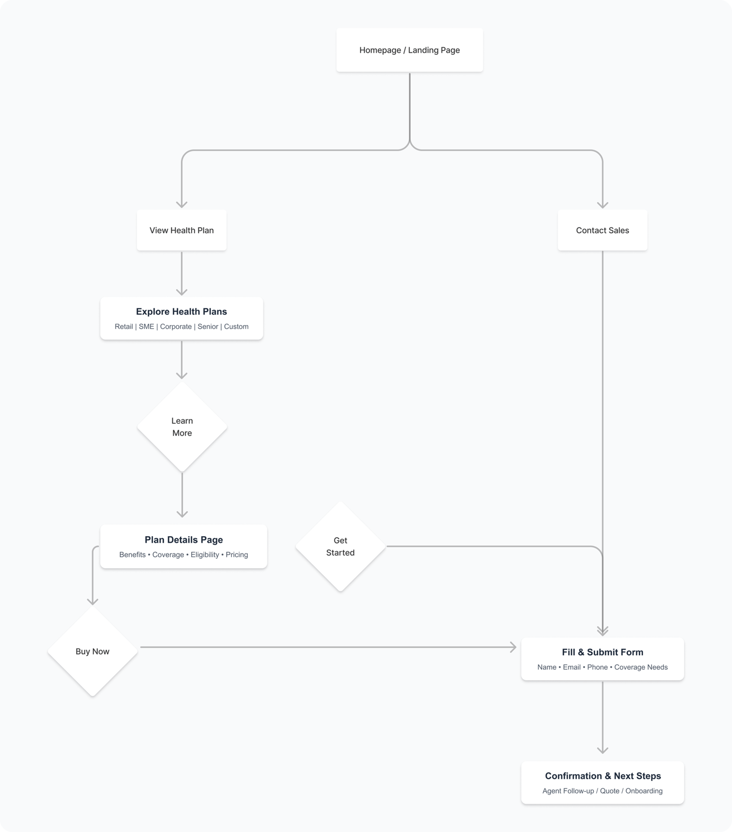
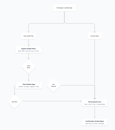
Buying a Health Plan User Journey flow
DOTHMO WEBSITE
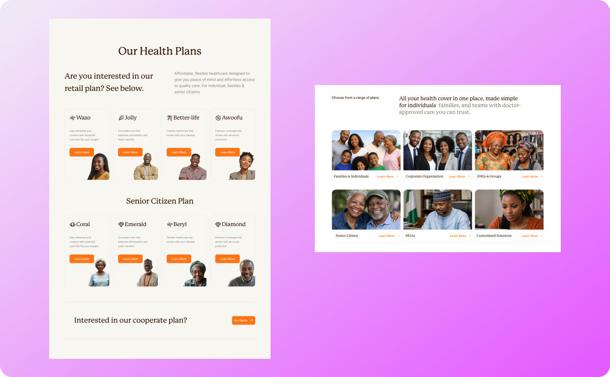
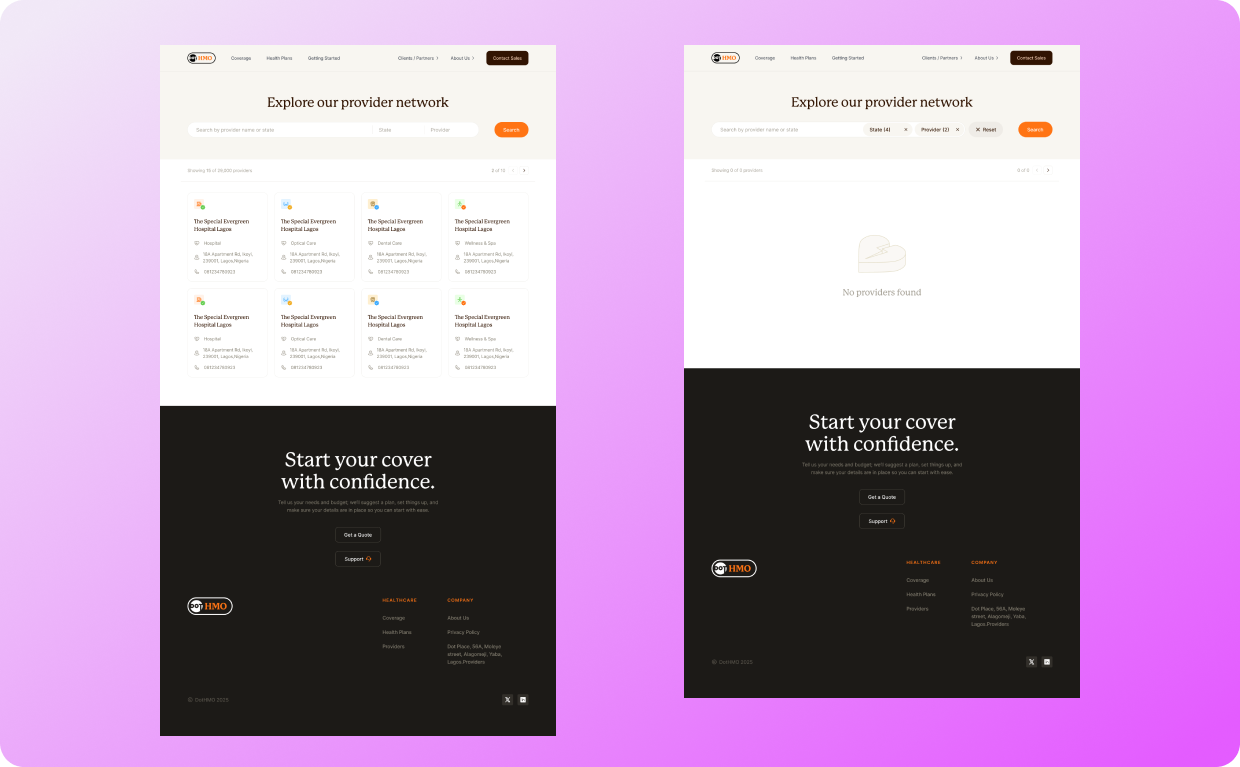
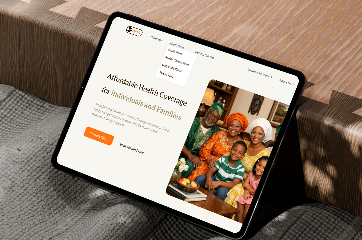
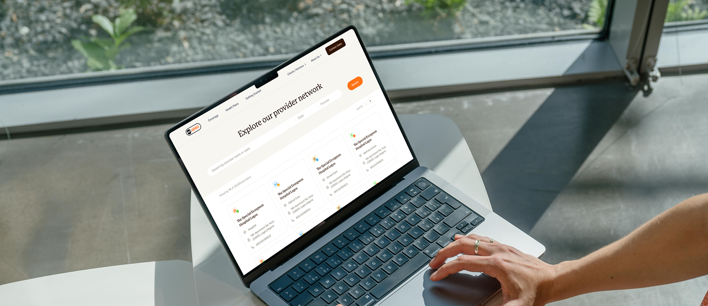
Visual Design & Final Screens
I designed high-fidelity website screens in Figma, focusing on clarity, accessibility, and consistency.
Key design considerations included:
• Clear information hierarchy
• Simple and intuitive navigation
• Readable typography and spacing
• A friendly, trustworthy visual tone
The final designs were implemented by the developer and are now available as a live website.
I will continue to iterate and refine the design based on user feedback and stakeholder input to ensure ongoing usability and business alignment.
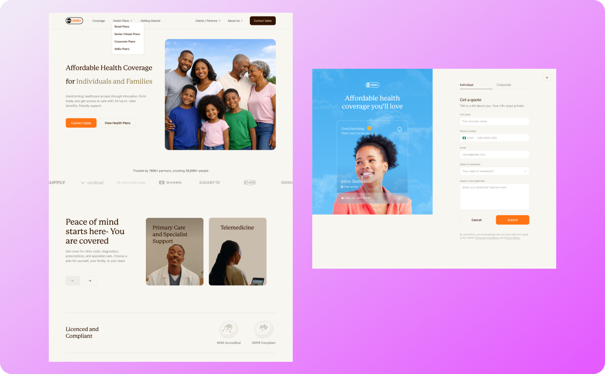
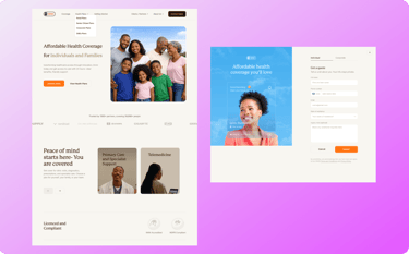
Landing Page/ Homepage and Contact Page